PR: Festa della Repubblica: Italian Artists to Show Exciting New Works at Gallery Sitka West in Fitchburg on June 2
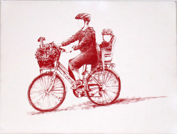
Red Bicycle by Tommaso Chiappa
FOR IMMEDIATE RELEASE
May 17, 2018
Contact: Tamar Russell Brown — 978.425.6290
Festa della Repubblica: Italian Artists to Show Exciting New Works at Gallery Sitka West in Fitchburg on June 2
FITCHBURG, Mass. — The Festa della Repubblica is one of the most important national holidays in Italy. Celebrated every June 2, it commemorates the referendum in which the Italian people voted for a republic and retired the monarchy after World War II. It represents a spirit of leaving the past behind and moving forward to new adventures. An all-Italian group of artists will celebrate those artistic adventures at Gallery Sitka’s upcoming exhibit in Fitchburg.
Ylenia Mino was born at the foot of the Italian Alps in the little town of Ivrea in 1987. Ever since childhood, she has dedicated all her spare time to drawing or painting. Her mentor during her artistic apprenticeship was Egyptian oil painter Ali Mohsen. She managed this education while also excelling in classical studies including ancient Greek, Latin, philosophy, and art history. She also found time to develop a passion for dancing, singing, and acting.
In March 2011 Ylenia debuted as a solo artist at the International Artexpo, New York. In the following years, she exhibited in Austria, Italy, and England. In the United States, she has mounted shows in Los Angeles, New York, Boston and Martha’s Vineyard. One of her dreams is to exhibit her work in every country in the world — an ambitious goal, surely, but one that the young, energetic artist might well achieve.
Ms. Mino has a special relationship with the Chuck Jones Center for Creativity in Costa Mesa, Calif. Her renderings of Wiley Coyote and other well-known Warner Bros. cartoon characters can be found on her official website. Her paintings have also been featured in publications such as i-Italy, Descubra New York, the British art magazine Aesthetica, and City to Country magazine, as well as on such online publications as The Art World (the-art-world.com), tweetspeakpoetry.com, and The New York Optimist.
Ylenia supports a variety of charities and good causes. She hopes this support will help give people a chance to develop their full potential and liberate the creativity she believes lives inside every one of us.
Many of Ms. Mino’s paintings seem to be studies in contrasts where different fields of light and color play off against each other and produce a surprising air of balance and peace. In one landscape, “Journey,” Ms. Mino presents two rows of trees, which curiously look a bit like two sides of a hallway leading into the distance. This could be a stand of typically Italian trees, perhaps of the Italian Stone Pine variety — tall and straight, with little in the way of low-hanging branches to allow one to climb up or even to reach for a leaf. The leaves are dark green and contrast markedly with the pool of yellow sunlight invading the picture in the background, spilling into the foreground, which is covered in the cool shade of the trees. But the trees in the background are practically dissolving in sunlight. Their leaves are astonishingly more yellow than green. Such a stark contrast would seem jarring if the overall effect were not soothing, almost hypnotic.
Ms. Mino has a wonderful feel for seascapes as well. “Before the Storm” shows us a lonely sailboat at night making its way into port — hopefully, since such a tiny craft is not well-equipped to survive the coming storm. One only gets a feeling of the rough weather approaching because of the gathering clouds, which might not be very visible at all if it were not for a full moon that has seemingly pushed them back. We find here again a bold contrast in light and dark. The little sailboat is just an outline in a very dark grey, and the wave about to crash on the viewer is also on the dark side, away from any significant light source, and hence is very dark indeed. The hillside to the right that slopes down into the sea is also not reflecting much light, and the sky just above the moon is midnight blue. But that full moon dominates the picture. It is a great white disc turning the surrounding clouds almost as white and making much of that roiling sea an impressively bright blue. The moon is so bright that it reminds us of the daytime in the midst of night. (We hardly ever think of the blunt fact that a full moon is bright only because it is reflecting the light of the sun. When the Earth’s shadow blots out the moon, we can hardly see it at all.) The storm is still out on the horizon, adding a surprising tinge of red to the clouds that are charging in on us and will probably brighten up the sky very dramatically in a few minutes when the lightning begins to flash.
“In all my paintings there is a story,” says Ms. Mino. Many of her paintings evoke wonder and joy and a generally very optimistic attitude toward life. “I can’t define myself as a member of any school,” says the artist, though she does note that her art expresses some aspects of impressionism and realism and occasionally even abstract expressionism.
Patrons can visit yleniamino.com to learn more about the artist’s work and extensive exhibiting schedule.
Roberto Perotti combines a remarkable resume in his profession of psychotherapy — he has authored two books on the subject — with an extensive exhibition record as a painter. As if this were not impressive enough, he is also the author of “Ombre,” a novel he published in Italy in 2004. Mr. Perotti began painting in 1965, and notes with pride his association with a group of Italian artists and writers that includes Oreste Bogliardi, one of the founders of abstract art in Italy, as well as the sculptor Sandro Cherchi, the writer Nino Palumbo, the painter and sculptor Franco Bagnasco, and other notables.
Mr. Perotti regards himself primarily as an abstract expressionist, or an artist who does what he calls “action painting” in the manner of its most famous practitioner, Jackson Pollock. The artist believes that “instinct prevails over rationality” in this style, but insists that abstract expressionism cannot be dismissed as chaotic or beyond the artist’s control. In other words, instinct and emotion drive the method of creating the picture but the composition is just as much subject to the artist’s conscious manipulation as works in the classical or representational schools.
This can be seen in Pollock’s most well-known pictures, immense canvasses such as those enshrined at the Museum of Modern Art in New York. Pollock did not paint meticulously with a brush. Rather, he flung his paint onto the canvass with a stick, which struck many of his contemporaries as simply wild and hardly akin to the careful, often photographically realistic compositions that we associate with the tradition of Western oil painting.
Yet Mr. Perotti insists that instinct has a structure. It operates according to predictable patterns. It has a logic of its own. It interacts with the artist’s rational mind by seeking an obvious kind of balance and equilibrium. Mr. Perotti points out that his work always exhibits “chromatic balance,” so that the different colors in a given painting blend harmoniously. They might seem to be “battling” each other, in a sense, but in fact, they achieve a kind of repose. They show the artist’s rational mind at work by giving instinct just enough rope, as it were, to express extremes of emotion and passion without spinning off into chaos and meaninglessness. Anger and emotional turmoil are continually pushing the envelope, but they never break away from the artist’s command.
The paintings that will appear in the Gallery Sitka show are excellent exemplars of Mr. Perotti’s method. One notable picture presents two large discs (or sections of them) that one might take for close-ups of planets or stars. But this is by no means representation for representation’s sake. We have no reason to think of these round shapes as anything from the “real” world, but we do recognize them as basic shapes. (In some paintings, Mr. Perotti does intend a shape such as these disc-sections to come across as an architectural feature, as a dome. As the artist sees it, the dome illustrates “a complex vision of the Sacred,” or what he also calls “the beyond.” This recurring theme in Mr. Perotti’s artwork began with his ideas about how Man confronts the mystery of existence by way of “the intuition of an unlimited power that transcends him.” Once again the artist is driven to create abstract images that are not wild and chaotic but do indeed follow certain recurring patterns and structures.)
One disc is white, the other a pale yellow, and the background is a uniform grey. Conscious control is obviously at work here. And yet this is also the imagination at work, not a mere illustration of an object the artist is trying to “re-present.” The two discs are made with the paint poured on thick and textured, while the thin, lightly applied grey background definitely reminds us of the emptiness of cold space. What then should we make of the somewhat shocking drips of red paint that fall down the middle of the composition but just barely avoid touching the white and yellow discs? This is not the red of fire but the red of blood. And how irrational that blood seems among these almost sculpted, classical fields of color! That red seems like an invasion of earthly messiness, a leap of living matter into a cold, symmetrical, unchanging environment. The contrast knocks us back a bit, worries us. Mr. Perotti’s chromatic and compositional balance are holding this picture in a high state of tension that is indeed rational, but the emotions the picture plays on are from that world of instinct and mystery that we tend to associate with the “ir-rational” and the wild.
In another painting, “Doppia presenza,” it is tempting to see the vertical slashes of color as a tightly packed column of human bodies. Are they soldiers marching? Are they political protesters marching? Are they exhausted, half-asleep city dwellers on their way to work in the morning? Or, are they people at all? They certainly don’t need to be. No representational figure is needed to play the part of these bars of color. They are all generally the same shape and seem to be working on a common project. This may indicate the artist’s conscious control again, but not simply to tell a story about soldiers or workers that we have heard a thousand times. Rather, the colors and shapes may be working on our emotions directly, without any “story” getting between us and the artist.
This picture also features a large section of a pale yellow disc, much like one of the discs nearly missing the spilling blood of the other painting. It also features a lonely grey background (though this one partially reflects the yellow of the disc). But the background is too strange to remind us of anything representational. The very thin, horizontal grooves scratched into the dark grey pigment seem to balance off the somewhat violent effect of the vertical bars. The two sections of the picture are opposite enough in orientation to provide a kind of equilibrium. But this does not “explain” the ghostly patches of yellow in the grey or the somewhat darker vertical bar of grey that breaks up anything like classical balance or rationality. That background does nothing to reassure us. It irks us, irritates us. Once again, the strangeness of the composition seems to wrench raw emotion out of us, whether we like it or not. In short, it fulfills Mr. Perotti’s goal of forcing the viewer to dream, feel and think.
The artist makes a clear distinction between technique and creativity. Technique is associated with skill that allows the artist merely to copy famous works of art. It allows us “to copy them but not to create them,” as Mr. Perotti phrases it. Creativity is a process of bringing out the essence of what the artist feels and wants to communicate. Creativity transcends mere technique — but it is really quite rare.
Taking the kind of positive attitude that we also see in the work of Ylenia Mino, Mr. Perotti believes that “beauty cures.” Beauty nurtures and heals us.
Art lovers can learn more about Roberto Perotti’s work at robertoperotti.it/en, especially in robertoperotti.it/en/selected-works-roberto-perotti/
Tommaso Chiappa paints pictures of people. But the people have no faces.
Doesn’t this say something about the big, noisy, busy, frantic cities that most of us live in? We see human figures all day long, but how many times a day do we notice someone’s face? Not many. We’re in too big a hurry. So are they. And when we do look at their faces, perhaps we’re still in too big a hurry to examine it in detail. When we do look very closely, the other person might resent it — and then we had better keep on moving.
Some of the faces do begin to appear, just a little bit, in Mr. Chiappa’s pictures, which are painted in acrylic in bright, bold colors. It’s almost as if those particular faces began to interest the artist…just before he had to hurry off to his next destination.
Mr. Chiappa also produces paintings in “black & white,” or rather black on a white surface that gives the effect of a charcoal drawing, or indeed, of a black & white movie from the days before cheap color film was developed in the 1960s. (Think of how “Eight and a Half” is in black & white but “Giulietta degli Spiriti” — and every one of Fellini’s films thereafter — is in color.) But the color paintings are often in one color, as in “Red Bicycle,” while in others he used several colors — but each human figure all in one color. For example, one untitled work shows us three young men sitting cross-legged on the street pavement (or the floor, inside — we can’t say for sure), with one figure completely in blue, one in green, and one in red. The fellow taking the photo is all black — that is, painted in black & white.
In one painting that shows no human figures, “Rosso, Giallo, Blu” (“Red, Yellow, Blue”), Tommaso combines the black & white approach with color in three spots on the painting, each one also showing the black shading of the “original” black & white painting. The door is a bright red, the pediment above the door is yellow, and what lies behind the first-story window is blue. It’s as if the colors don’t like being ignored and they are fighting to get into one of the black & white pictures.
Mr. Chiappa hails from Palermo, the largest city in Sicily and one of the largest in Italy. He formally studied art in Milan, at the opposite (northern) end of the country, and at the Academy of Brera, where he had exhibitions of his work at the Luciano Inga-Pin Gallery. He has exhibited throughout Italy and abroad. He has also shown at Malagnini Art Center in Saronno (2015 and 2016) and at Villa Magnisi in Palermo.
Mr. Chiappa’s website, tommasochiappa.eu, provides more information about the artist’s work and activities.
Roberto Mazzonetto likes to see iron, steel, brass, copper, and other metals “surrender” to the applied art of a skilled craftsman. He has been fascinated since childhood with the ancient art practiced by his father, Sergio, a master in creating beautiful artwork in wrought iron. Roberto was born in Varese (in northwest Lombardy, not far from Milan) in 1968, inheriting a great artistic tradition and a love of making beautiful objects from metals.
Roberto worked in his father’s shop from a young age. He made his debut in Ville Ponti in Varese in 2006. About this time he was fortunate to meet the architect and artist Marcello Morandini, who encouraged and mentored the younger artist. In 2013, Mr. Mazzonetto collaborated with the architect and artist Luca Scacchetti and struck up a friendship with the psychologist and art critic Dottoressa Alessandra Lancellotti. He has participated in art festivals in Rome, Palermo, Spoleto and other cities.
“Paesaggio (Landscape) No. 7,” a work in steel and brass, shows off the artist’s imaginative powers. The sky in this scene appears to be torn to pieces, as indeed the steel plate is torn and shreds of the steel droop down over what may be a field of wheat or barley, represented by a brass plate sewn onto the steel base with metal cables. Another work represents the lovely seaside city of Vernazza on the Italian Riviera. This work adorns its steel base with smaller plates of brass and copper, the brass seeming to be the undulating sea and the spectacular cliffs plunging down to the water, while the copper seems to “stand in” for the buildings of the town as they tower over the crashing surf below.
Art lovers will want to visit ferartdimazzonetto.it for more information about Mr. Mazzonetto’s work.
Included in the show will be a small group of submissions from other artists, including our own Linda Cuccurullo, Ruth Lague, Joelle Feldman and local artist Nina (Maneri) Arnold. We will also have on display student work by The Deacon Jones Art Club. Those young people are as follows:
Grade 7
Daiyanalis Diaz
Melanie Melendez
Felicia Moua
Grissmarie Vazquez
Talena (Jackson) Rocci
Grade 8
Yineishly Mendez
Karyliz Colon
Dianelys Montanez Negron
Lea Nogueira
Jennifer Le
Felicia Grant
Crystal Moulton Ortiz
This event will take place on Saturday, June 2, 3 – 5 p.m., at Gallery Sitka West, 454 Main St., in Fitchburg, Mass.
Join us after the opening for a true street festival! Right in front of the gallery! Join us for Fitchburg’s 2018 Festa Della Reppublica — our Italian Festival!!! Join us for Face Painting, Fried Dough, Italian Pastries, Italian Dancing, Music and Art, Pizza, Espresso, Vino & Birra, a Homemade Meatball Competition and more on the street in downtown Fitchburg on Main Street to celebrate our rich Italian heritage! There is no entrance fee and this event is open to the public. Main Street will be shut down during the event.