FOR IMMEDIATE RELEASE
October 23, 2017
Contact: Tamar Russell Brown, Gallery Sitka — 978.425.6290
Three Encaustics Artists Will Be “Waxing into Winter”
with Stunning Colors and Textures at Gallery Sitka in Fitchburg
FITCHBURG, Mass. — With an opening on Saturday, Nov. 4, three fascinating local artists will present works all in the waxy medium of encaustic, yet each approaching it by way of her own distinctive aesthetic. Each artist has a different take on the possibilities of this remarkable medium.
Painter Kellie Weeks considers herself an abstract, not a representational, artist. Indeed her paintings are dynamic studies of pure color, light, and form. She has spent a number of years experimenting with various media but now is focusing on encaustics, incorporating dry pigments, metal leaf, shellac, and other materials. The medium gives her a means of expression of unsurpassed quality, depth, and brilliancy.
Ms. Weeks is continually seeking to make her insights into a transcendent world concrete and permanent, searching for what Mark Rothko called “an anecdote of the spirit.” As in her “Memory Series” of paintings, she explores the world of memories that undoubtedly change over time and which take on something of a life of their own in our dreams. The work seeks to express “what’s lost and what’s remembered,” that tension between our thoughts and feelings that may always be near the surface and those that may remain deep within us, influencing us in sometimes mysterious ways.
Paintings such as “A Place of Rest” indeed express harmony and balance, with the colors and shapes complementing each other. In other pictures, by contrast, various elements seem to be competing. “Holding Ground,” for example, seems to be the site of a battle among various shapes and colors. The artist appears to have dripped some pale yellow wax on top of already cured layers, but the little streams of yellow wax are somewhat jarringly horizontal, not vertical! Obviously at time of dripping the molten wax ran down from what at that stage must have been the top of the picture. Once it solidified, the finished painting showed us wax dripping “across” the canvas, not down, as it would have to do in a more mundane, predictable world. This defiance of gravity is audacious enough, but then stark, thick bands of yellow and red seem to be just as defiant and uncooperative. Even so, the lines are all encountering each other at right angles, all verticals and horizontals, so that a “logical” pattern seems to appear amid the chaos.
Ms. Weeks received her Bachelor of Fine Arts degree from Bradford College in 2001. She has exhibited nationally in many juried and group shows, and in 2011 was included in a group show called “Imagination” at the Museum of Modern Art in New York.
Jeanne Borofsky has a wonderful work ethic: “I like to have fun when I work,” she says. “Combining two of my favorite activities—folding origami and painting with wax, I construct images that explore the use and interaction of color with whimsical references to my dreams and fantasies.”
This is evident in some of the paintings she will be showing at this exhibition. A number of these involve the intricate origami structures that take on color and life from the hot wax layered overall. In the mix, various personalities—Ms. Borofsky likes to call them “creatures”—appear in unexpected places. In “Home Sweet Home,” for example, viewers may find two persons, one a giant and one a “normal”-sized person who nevertheless both seem to be creatures from another world. They don’t even seem quite at home in the castle itself, which is much more machine-like than organic, with various dials and ducts and main-boards showing (although some of the structure defies the techno-motif, plainly being made from tree branches).
In “City Block 1,” the structure appears to be literally a cube or a wood block but could also be a package, what with it carrying a postage stamp and a postmark superimposed. But once again the creatures so familiar to fans of Jeanne’s work appear. In this case, it may be a diminutive brontosaurus poking its head out from the three pointed-roof houses that ride on top of the cube. Is this block meant to be stationary, a feature of the city—one block, to use another sense of the word, on the streetscape? Or is it a package, making its way all around the world, or anyway around the world of Jeanne’s imagination? One could make a case for both.
“City Block 2” seems to be the home of a pterodactyl (or a winged dragon?) rather than a brontosaurus. And the domicile represented in “City Block 3” appears to be the residence of a butterfly covered in a sublime shade of blue with antennae of copper wire. The origami castles are very smallish, cozy places, even though they remind us of the fantastic, larger-than-life aspect of crazy, late medieval architecture.
The Borofsky family sometimes collaborates on works of art. In one picture, Jeanne uses a line from a song by her son Nate: “…no final last stand, just a never-ending ride…” That fun, playful, and above all optimistic view of life and art is always in play (so to speak) in Ms. Borofsky’s work (the fun kind of work, that is).
Ms. Borofsky holds BFA and MFA degrees and has paintings, prints, and drawings in numerous museums and private collections. Her versatility as a painter is plain from the variety of media she has worked in — watercolors, oils, rubber stamps and collages, and encaustics. She is also an accomplished printmaker, in traditional, photographic, encaustic and digital modes.
Artist and Art Therapist Darcy Schultz defines the ingredients of encaustic very precisely as beeswax, Damar varnish (tree sap), and ground rock pigments. She has been working with the medium for eight years, very happy to be handling a natural, non-toxic material. The word “encaustic,” she notes, comes from the Greek and means to “burn in.” The beeswax is applied molten and hot. It then cures very quickly and once it’s solid another layer can be applied over the first, and so on for as many layers as the particular painting seems to require. Because encaustic is so versatile in creating textures, it takes on form in ways that oil paint never could. (Some artists even use it for sculpture.) Because it is translucent, Ms. Schultz says, it reflects light back in fascinating ways—it “glows.”
Darcy draws much inspiration from her excursions into the wilderness. She grew up in Wisconsin, lived for almost 20 years in the area around Portland, Oregon, and now lives in Central Massachusetts. She has always been an avid hiker and backpacker and makes it a goal to travel as far out into the wilds as possible. At that crucial distance from the human world, she says, “You become part of nature. You can’t even see humankind’s footprint.”
In that superb quiet Ms. Schultz finds she can be meditative. By escaping the ceaseless noise and hullaballoo of our lives in town, she begins to see an altogether different reality. This “spiritual venture” is not an intellectual exercise but is deeply rooted in the soil, the water, the sky and their perception by the body. It begins with “the human body’s experience of the spiritual landscape,” she says. She sees patterns in the quietude of the forest or the sea or the mountains that she would never be able to get in touch with in the city. “Patterns are magic,” she says, and the insights she gains in the wilderness give energy and direction to her art.
Olympic National Seashore in Washington State, Acadia National Seashore in Maine, Volcanoes National Park in Hawaii, and the Pemigewasset Wilderness Area in New Hampshire are among the many wild places Ms. Schultz has sought out. Much of this terrain is very surprising. For example, the dunes on the beaches near Green Bay in her native Wisconsin are so spectacular that they compare to the dunes one finds at the windswept far end of Cape Cod. Hiking around Mount St. Helens in Washington, in the days not long after the memorable eruption of the volcano, “was like walking on the moon.”
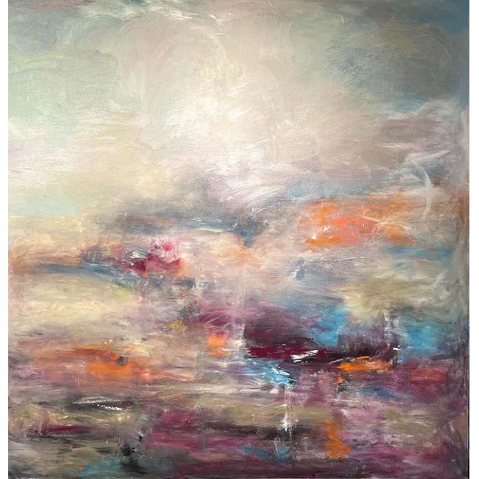
The effects of such startling images come through vividly in Darcy’s paintings. The work is abstract, of course, not representational, and hence seems to convey not pictorial copies of the spectacular scenes that Darcy has witnessed in the wilds but rather the intense feelings associated with those scenes. For example, “Pulsate” suggests the kinds of spiritual experiences that the artist has gone through during her forays into the wilderness. The painting is a study of warm reds and yellows expanding out from the center of the picture, perhaps expressing something about the life force itself. These colors contrast strongly with the periphery’s very peaceful blue and blue-green. Yet, interestingly, the warm and cool colors meld into each other without clashing or overwhelming each other. The viewer gets the sense of a harmony of opposites that is by no means static or brittle. The two main color areas are in tension but not at war, and it is very hard to find where the warm center ends and the cool periphery begins. The image does seem to pulsate. It almost appears to be in motion.
“Shades of White” also keeps the viewer guessing about color, as the somewhat ironic title implies. Obviously, we are seeing many different colors at play while an insistent sort of white seems to be pushing through from behind the other colors. Encaustic gives the artist a means of layering one “glowing,” translucent color field over another, which creates that remarkable sense of motion. The very rough textures in both paintings add to this feeling. But in “Shades of White” there is a feeling of stability created by the bold vertical lines cutting from top to bottom, and also by the smallish circles cutting very cleanly and starkly into the rough texture. This suggests a kind of chaos being brought at least partially under control by the regularity of the evenly spaced circles.
“Tranquille” offers a feeling quite different from the other two paintings. Instead of vertical lines “cutting” into a rough surface, we find lines in relief, rising above much of the surface area of the picture. It almost seems like a counterpoint to “Pulsate,” which creates a kind of energy and excitement. “Tranquille” indeed provides the viewer with a measure of tranquility and peace of mind.
Ms. Schultz holds a Masters in Art Therapy from Marylhurst University in Oregon, as well as a Bachelors in Ecological Communications from the University of Wisconsin–Green Bay. Her art therapy is psychotherapy that helps her patients express troubling thoughts and emotions. She may instruct a patient to address pain or anxiety by putting it onto the canvas, sublimating and transforming the disturbance into art. It’s a way of “using art to help facilitate communication.”
“Waxing into Winter” will open with a reception at Gallery Sitka, 454 Main Street in Fitchburg, Mass., 2 – 4 p.m., Saturday, Nov. 4. The show will run through Sunday, Jan. 7, 2018. Art lovers can access the artists’ work on Jeanne Borofsky’s www.dreamingprinter.com, Kellie Weeks’http://www.kellieweeksart.com, and Darcy Schultz’s darcyartstudio.com.